Table of Contents

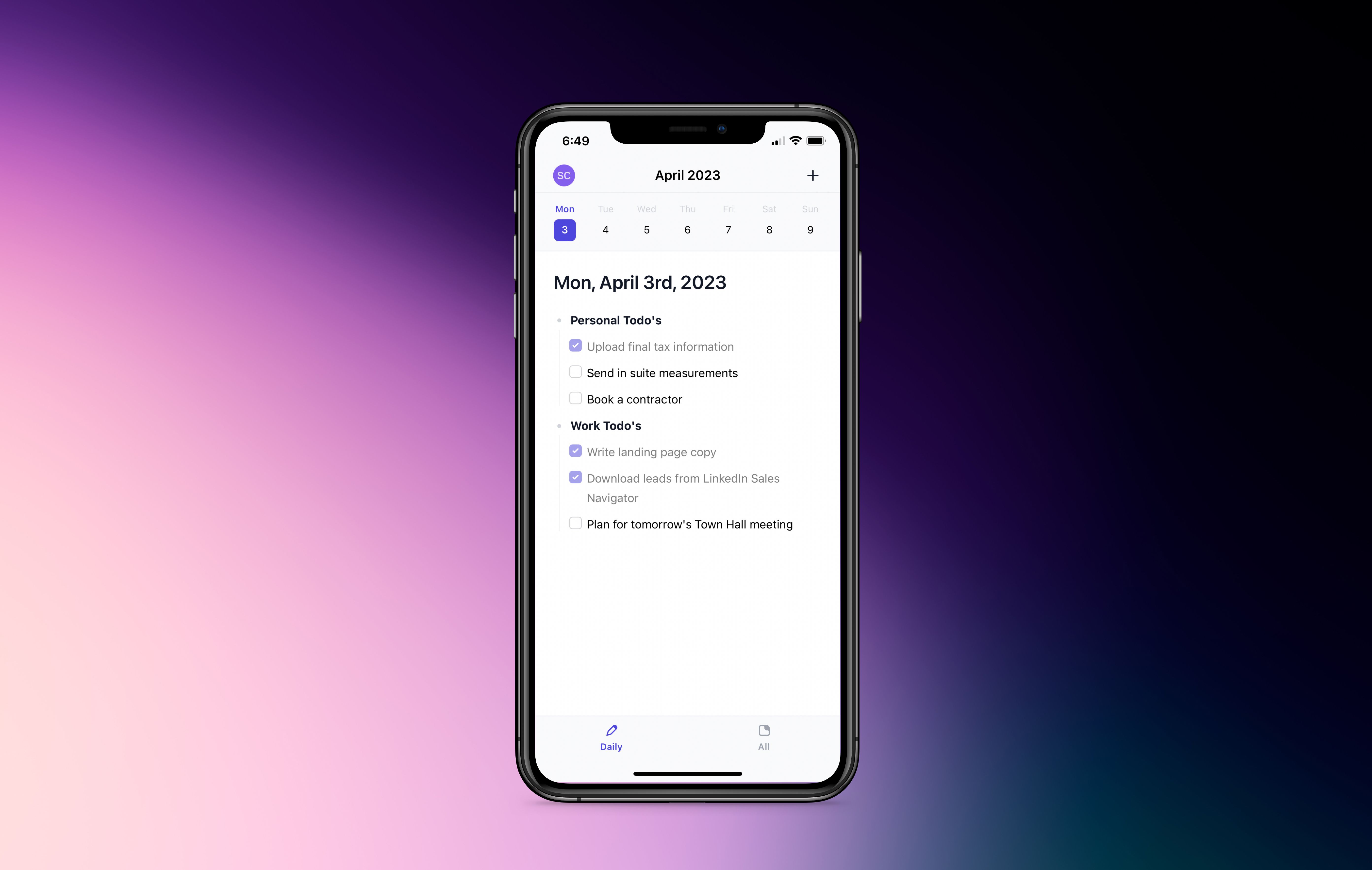
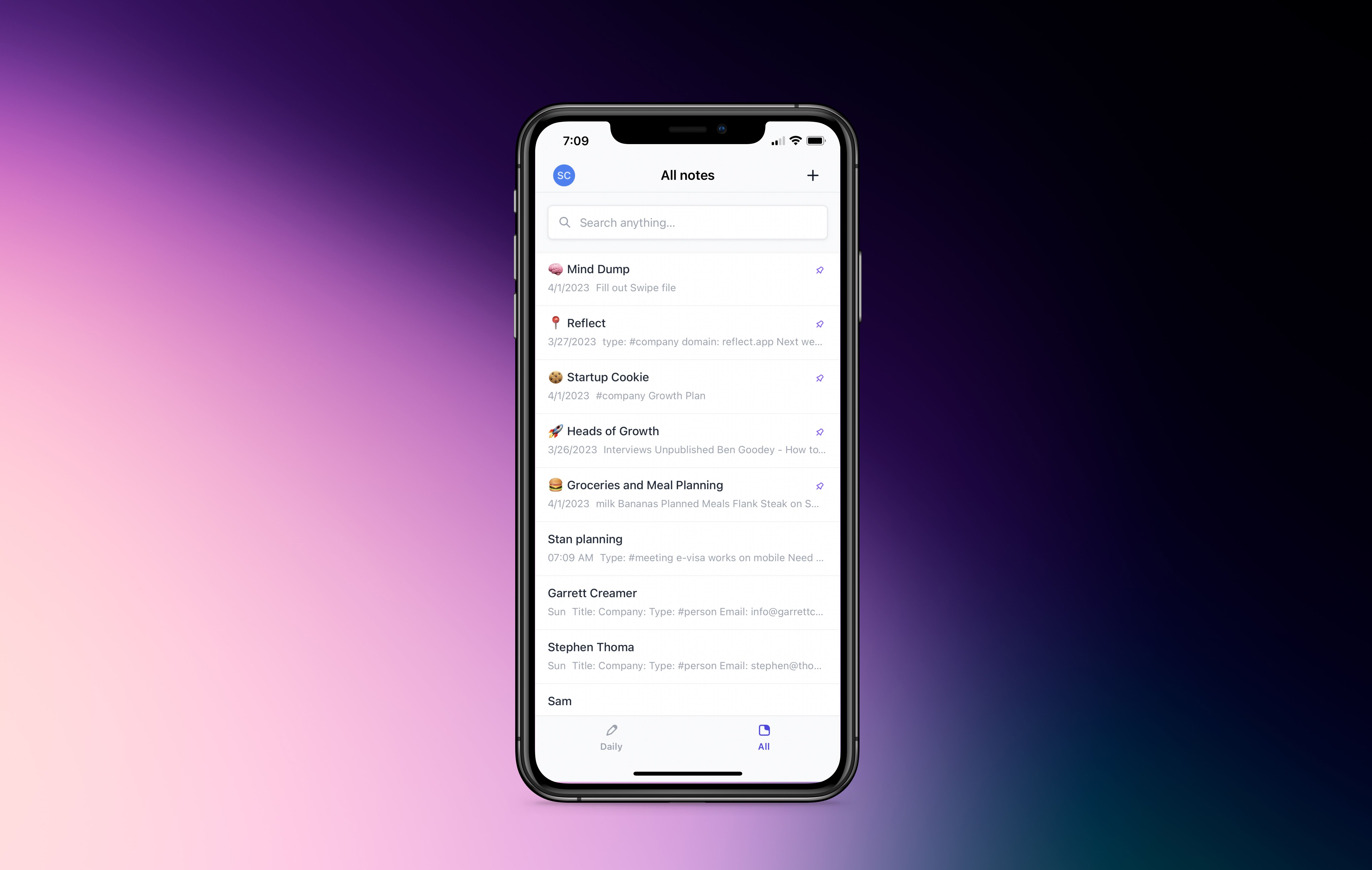
Some highlights from the new design:


We’ve released a fresh new design of our mobile app with a handful of changes that culminate in a wonderful user experience.
Table of Contents


We recently overhauled the entire codebase for creating and editing Lists (all 8,496 lines of it!). The previous iteration of the Lists editor was functional, but had its fair share of shortcomings. Given the importance of lists for note-taking, it's vital that they work as expected without interrupting one’s workflow. We thought we’d write up a little look into what goes behind the scenes at Reflect.

We’re kicking off 2023 by launching an AI integration that can drastically improve how you write and take notes. Our AI palette allows you to quickly highlight text and perform transformations on it. For example summarizing a note, fixing grammar and formalizing your writing, or pulling out key-points and action items.

We know many of you consider your subscription to Reflect an investment in our modest company’s future. Each day, our team diligently strives to enhance the product, bit by bit. That's why it brings us joy to share a monthly summary of the team's hard work and accomplishments.